.png)
The Queensland Government Design System was built for content-driven, browse-and-explore experiences where users navigate through topics, read information, and find what they need. That model works well for most of government's digital presence, it doesn't work for applications.
This project started inside myQld, a government services app where existing QGDS components were applied to a product context for the first time (officially). The gaps weren't about screen size, they were about interaction model. Applications are task-based: users are logging in, completing forms, managing credentials, tracking progress.
The patterns that support scanning a content page don't support completing a multi-step transaction. The foundations underpinning the component library told the same story.
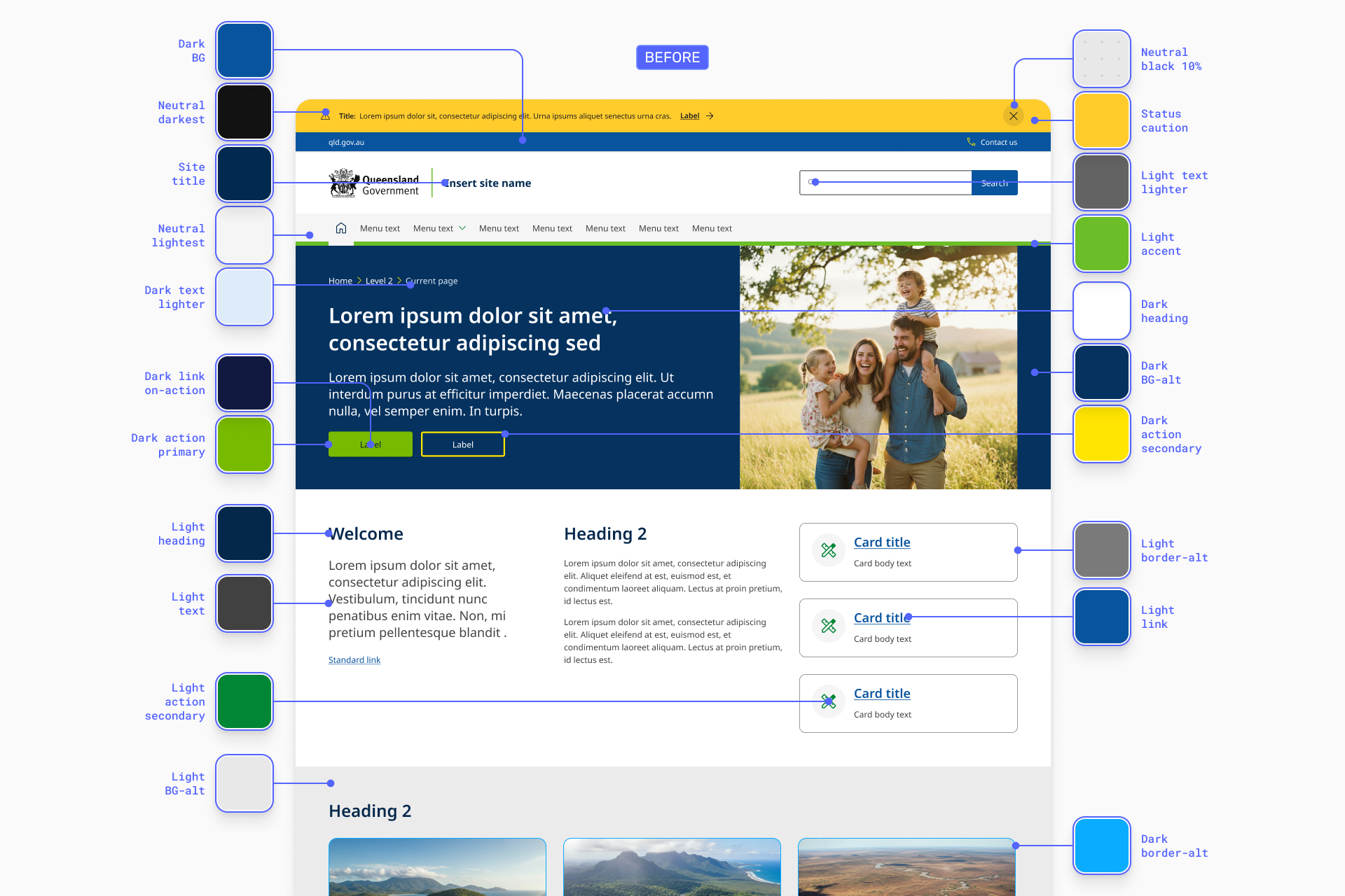
Colour had been designed with flexibility in mind, accommodating marketing campaigns and branded microsites across dozens of agencies. That flexibility made sense for content sites were visual differentiation help users orient across departments. In a task-based application, it became a liability.
The palette was stripped back significantly to enforce consistency across dense, interactive UI where colour needs to communicate state and heirarchy, not brand personality.
.png)
Elevation was the most rudimentary gap. The web system defined elevation almost entirely through box-shadow, enough for cards on a content page.
Applications layer elements differently: modals over content, layered menus, and deep interactive flows, with persistent navigation sitting at fixed depths.
.png)
A new elevation model was built from scratch with clear logic, using shadow, colour, element layering, and spatial relationships together to subconsciously communicate flow connections and assist with wayfinding.
Typography and spacing were previously calibrated for content consumption: long-form reading at desktop distances.
Applications need denser information architecture, tighter interaction patterns, and touch targets that meet accessibility requirements without crowding the interface.
Both scales were reworked for that context.
Just over 20 components were designed for the app kit. Some were entirely new patterns with no web equivelant. Others were extensions or variants of existing QGDS components, with nested elements or styles adapted for applications.
The interesting tension wasn't where the difference was obvious. System bars, persistent navigation, and app-specific chrome clearly needed new patterns. Those decisions were straightforward because the reasoning was self-evident.
The harder calls were components like cards, lists and buttons, where the visual difference between a content site and an application was subtle. They looked almost the same, which meant every deviation from the web system needed stronger justification grounded in interaction model, not preference.
The general principle: follow established product and platform conventions for interaction patterns, adapt the QGDS visual language for identity.
Apple's Human Interface Guidelines, Material Design, and consumer applications like Uber were reference points, validating that patterns would feel familiar to users who spend most of their time in non-government apps.
myQld was the starting point, but the kit couldn't be shaped by a single product. The component set was pressure-tested against other Queensland Government applications that could potentially adopt it: TMR's digital licence app, Education's QParents app, and the QChat conversational AI platform.
Each product surfaced different requirements. A licence app is credential-focused, a parenting app is notification-heavy, a services app is transactional, and a conversational platform is input-driven with dynamic content.
The kit had to support all of them without being so generic it solved none of them well. That cross-referencing process determined what belonged in the shared kit versus what was product-specific customisaton.
The Application UI Kit is currently available in beta, accessible on request through the QGDS team. It was built solo, with peer collaboration and feedback shaping decisions along the way.
The kit is already in the early stages of adoption by a range of agencies and platforms:
While the kit started as a side effect of one app project, it's becoming the foundation for how Queensland Government thinks about product and platform design at scale.