Queensland's government services app was being built for millions of people: different ages, literacy levels, devices, and degrees of confidence with digital systems.
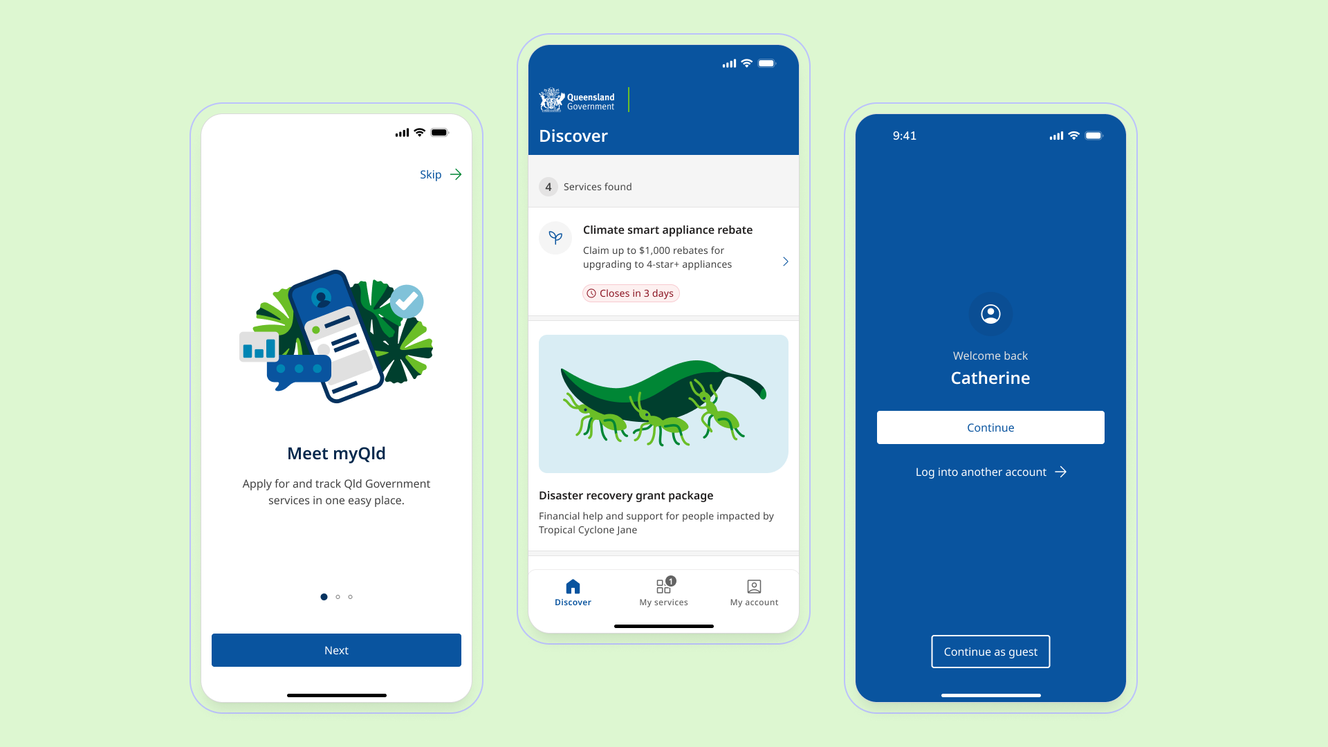
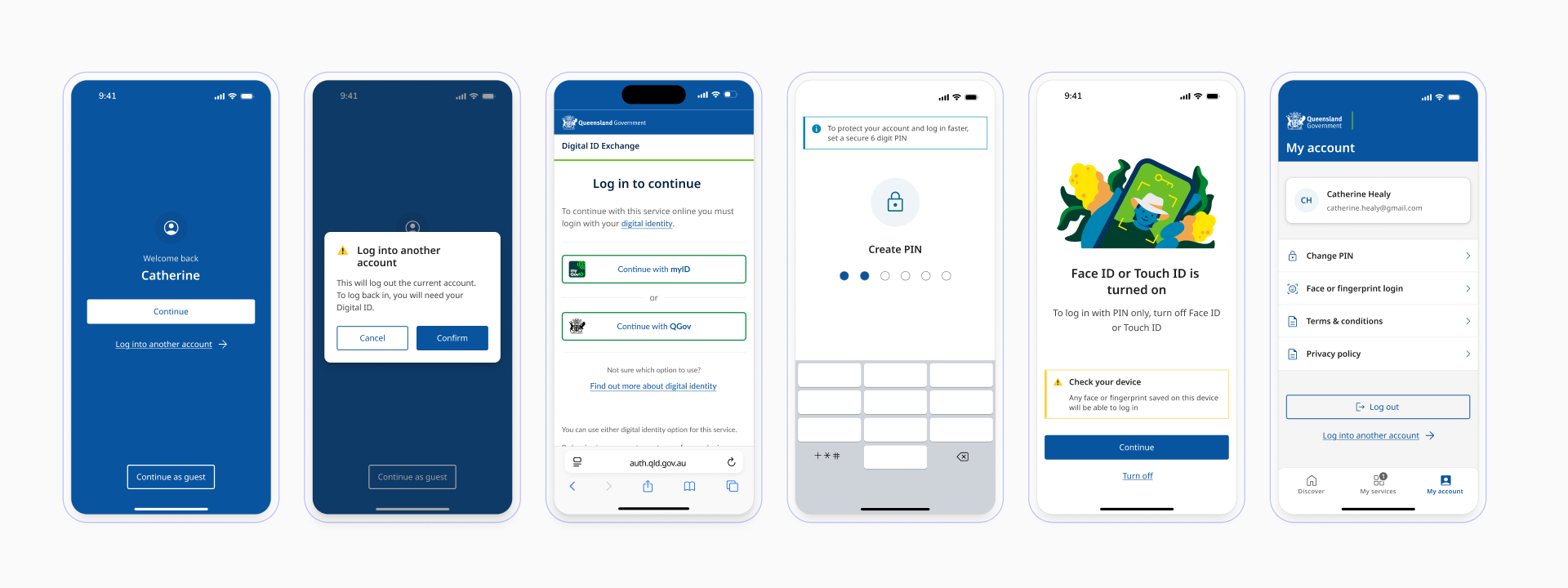
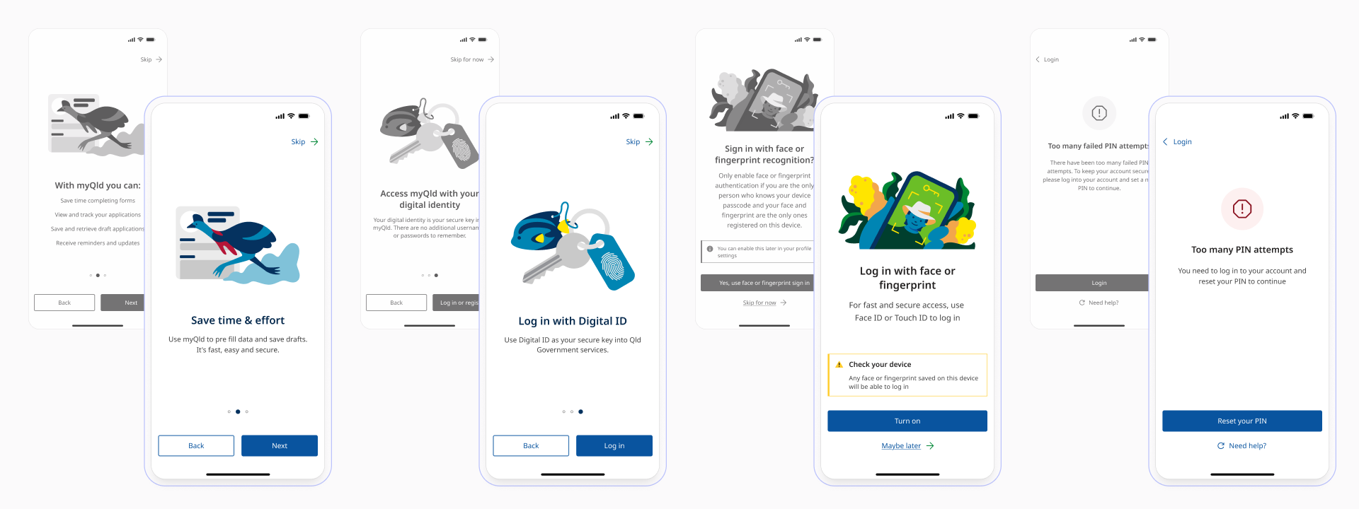
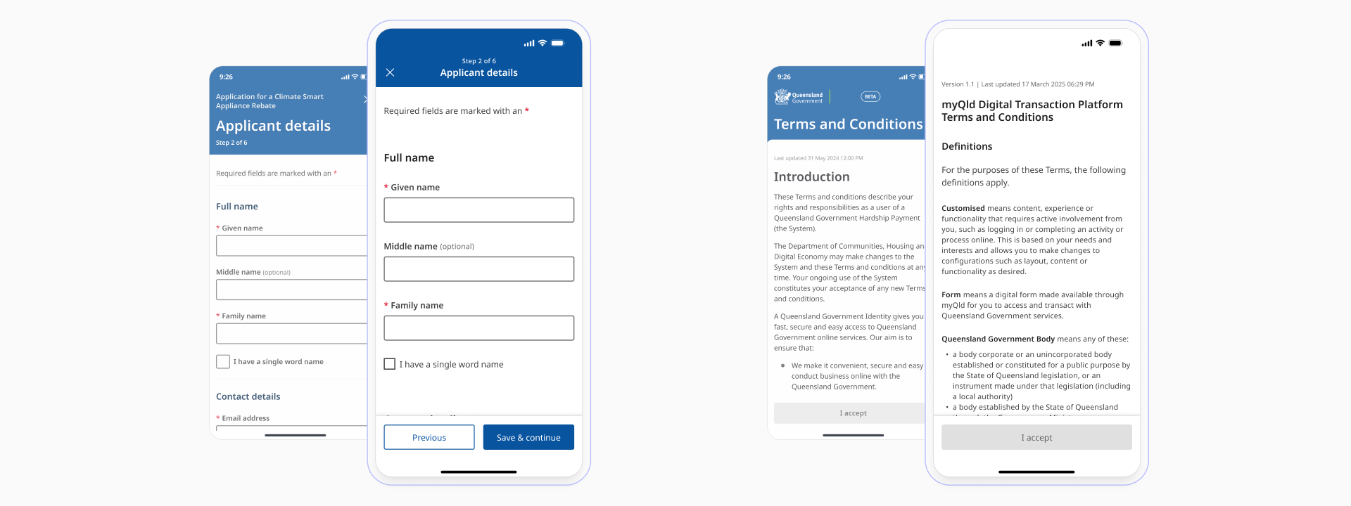
The myQld app gave Queenslanders a single place to apply for, manage, and track government services on mobile. Initial design and build of the app (before release) were done rapidly by external suppliers and contractors. Speed had been the priority, which meant consistency, attention to detail, and the wider customer journey weren't factored in. That surfaced a few key problems:
Identity switching without the friction
Federated login wasn't in place yet. That meant designing a multi-provider authentication system from scratch, supporting both Queensland Digital Identity and myID with the ability to switch between them.
The happy path wasn't where the complexity lived, it was everything around it: families sharing a single device, older users logging in on someone else's phone, people with limited digital literacy navigating a security-sensitive flow under compliance constraints. Each of those situations needed its own considered path rather than being treated as an afterthought.
Every realistic scenario was mapped out before any screens were designed. Edge cases were surfaced early, the logic was worked through with engineering, and the flows were shaped to hold up across all of them without compromising on security or making things harder than they needed to be.
Government language fails users before the interface does
The app had accumulated jargon across multiple teams and revision cycles. A holistic copy audit revealed terminology inconsistencies, passive constructions, and departmental language that meant nothing to the people actually using the app.
Every label, instruction, and error state was rewritten, aligned to the Queensland Government web writing style guide and the Australian Style Manual. Low-literacy users were the primary benchmark. The benchmark was always low-literacy users, making sure the language was clear and accessible for everyone rather than just technically correct.
Colour, elevation, typography, and component usage had all drifted from the Queensland Government Design System.
At the scale this app was designed for, inconsistency isn't just a polish problem. It erodes trust, creates cognitive load, and disproportionately affects users who rely on pattern recognition to navigate.
A systematic audit across every screen identified where components had diverged, where hierarchy had become unclear, and where the visual language was quietly working against usability. Each was brought back into alignment with the design system, tightening things up without redesigning from scratch.
The app context exposed gaps in the Queensland Government Design System: components and interaction patterns were designed for traditional web and didn't translate to apps.
Those gaps were designed, documented, and contributed back into the system, becoming the foundation for an extended component set adopted across Queensland Government applications (the App UI Kit).